Close your eyes and imagine it’s 2022 — we all yearn for a vacation, but we also crave a place of our own to zone out, warm up, come to life and practice self-care.
The primary bathroom performs like the therapist, the retreat and the getaway oasis of your home, and if you’re like us it may be the one place you put your phone and work away more than any other room. Function is always going to be foremost and there are a few “necessary” features we’re inclined to include for a smooth-running retreat but that doesn’t mean you can’t create a space of pure beauty. Read on to find out how we did it at our recent Weybridge project.
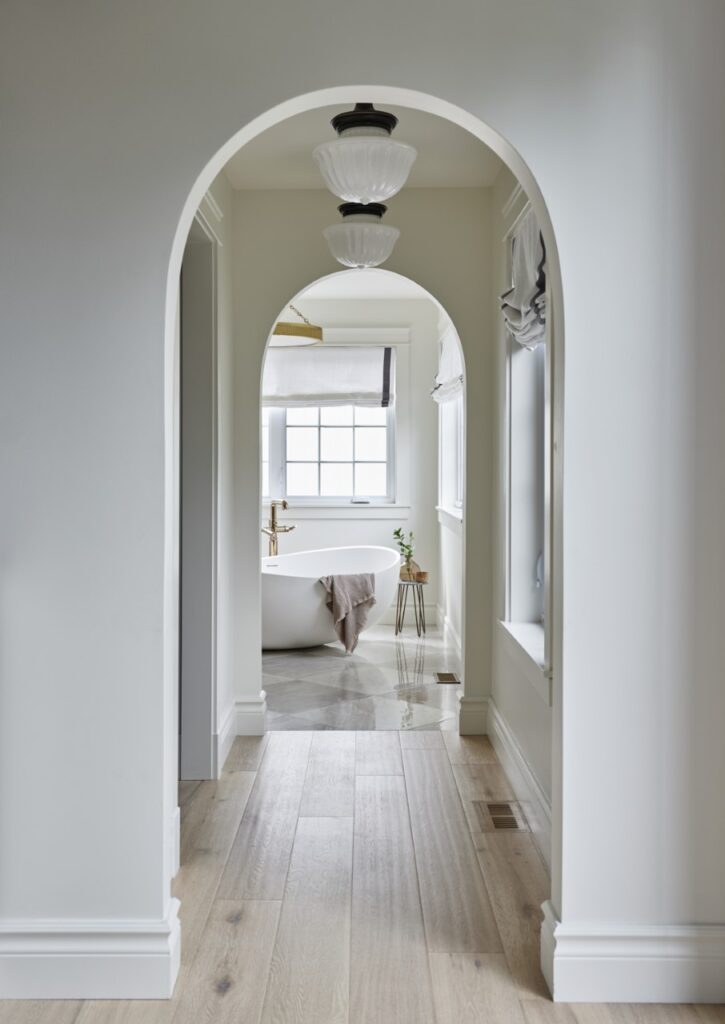
1. Honour the unexpected when choosing lighting placement.
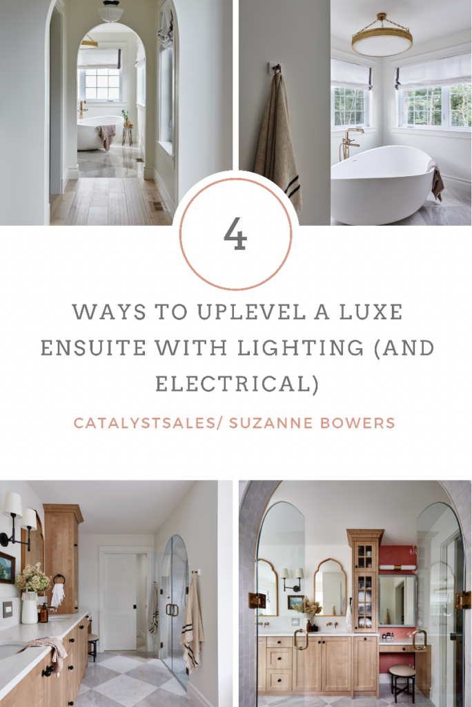
We’re in new construction so we know the drill — the electrical walk through in the ensuite bath would typically go like “tub light here, pots here, vanity bars above the sinks, plug here, switch here”. On our job sites these days, that could look a whole lot different — hey, just keeping our amazing electricians on their toes!
Here, we wanted the drama to follow a different flow, guiding you from the primary bedroom through the open hallway where we evoked old world with the Hudson Valley Lighting Dutchess pendants. Throughout the home, we’re seeing hallway lighting that’s packing heavy design impact instead of the usual pot lights or flush mounts. In the bathroom, another spot to get playful with placement is with vanity task lighting. If the natural light is abundant like it is here, toss around the idea of pendants or sconces on either side of a mirror, or one double-armed between two mirrors like we did here with a piece of vintage art beneath it as a way to fill the white space created by having two sinks further apart. It’s just a little something different.
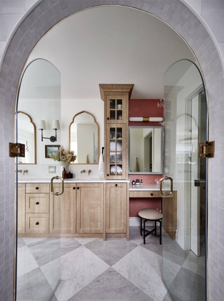
2. See yourself in a new light with an LED mirror.
Even though this space has plentiful natural light, the makeup nook we created with the reeded glass tower meant the top of our mirror was well lit by the knockout HVL Carlin wall sconce, but the bottom (where our actual face goes, when sitting) was in a shadow. Hello, Eurofase’s LED mirror collections. The Lenora had the perfect flush frame in a brass finish, which works so well in a modern traditional space and most importantly, solves the problem of poor task lighting over the vanity. The dimmable tone options provide a luminous glow and the tiny humans would say the touch sensor to change the tone is super cool. And they’d be correct.
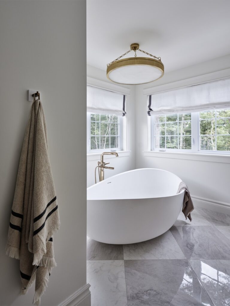
3. Organic, sculptural and Old World rule current bathroom lighting trends.
Over the past year, residential lighting has moved away from the industrial and in-your-face, toward a nostalgic, vintage vibe that we think works perfectly in a cozy, luxurious ensuite like this one. The much-loved gold finish trend of the midcentury moment has darkened to antique and brushed brass tones set against natural materials like the alabaster of our beloved HVL Lynden chandelier we installed over the freestanding tub.
The scale is BIG, but the old world chain and shade elements keep things romantic and soft. Other favourite materials we use to achieve the look include white shades made of linen, milk glass and fluted glass, and bowl shades are back in a modern way with streamlined details. Old World looks are definitely reminiscent of antiques but we’re doing them in an unexpected way that’s decidedly design-forward.
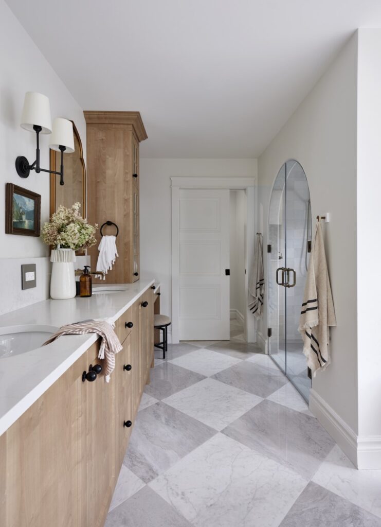
4. Prettify those plates.
We’re kind of known around town as the finicky folks who photoshop outlets and switches out of photos to keep the visual distractions to a minimum in a shot — “we don’t get it, what’s so wrong with a plug?” In this space, though, the Adorne collection by Legrand stepped in as the hero as always. Adorne’s switches and plates make a pretty boring functional piece into a design feature, like this one we installed right into our quartz slab backsplash.
Pinky promise we will never feel called to cover up with a vase or hide you with a photoshop job, sexy little thing. A retreat like this one deserves ALL the little details after all.
You might also be interested in:
